


Structuring an app is like building a house 🏡 There are many decisions to make, many views, many perspectives. Folder structure also plays a vital role. The mind is flooded with questions like where this folder/file should reside? Which place it should go to? What should be the name of the folder, file, component, hook or context?
It’s the developer way of life 💻
I normally choose the create-react-app to create a react app as it’s easy to kick-start development in no time & all the tools 🛠 like basic CSS file, build scripts, basic testing framework & PWA are included by default.
Starting with package.json
package.json
{
  "name": "app-name",
  "version": "0.0.1",
  "dependencies": { },
  "devDependencies": { }
  "scripts": {
    "start": "react-scripts start",
    "build": "react-scripts build",
    "test": "react-scripts test",
    "eject": "react-scripts eject",
    "stylelint": "stylelint src/**/index.css",
    "stylelint:fix": "stylelint src/**/index.css --fix",
    "📦": "bundlesize",
    "prettification": "prettier --write \"**/*.js\""
  },
  "lint-staged": {
    "*.{js,jsx}": [
      "npm run prettification",
      "git add"
    ]
  },
  "husky": {
    "hooks": {
      "pre-commit": [
        "lint-staged"
      ]
    }
  }
}
Scripts
Here is where all the magic lies, all the good things happen here
Build the app
Style the app
Test the app
Prettify the app
Lint the app
And many more
Some tips for scripts in package.json ✅
The script name should be easy to remember and small, Avoid using large names like build:then:check:what:happened
"scripts": {
  "build:then:check:what:happened": "react-scripts build",
  "are:we:building:then:check:what:happened": "react-scripts build"
}
My choice: using emoji 😉 as a script name. Let me know whatyour favorite emoji would be for building or deploying code, for me, building the app is 🥳 and for deploying the app is 🚀.
When I use Tailwind CSS, I tend to name the script as build:style, so it's easy to identify that it's a style related task, you can also name it to be specific to the framework/library like build:tailwind if you're using multiple styling frameworks.
"scripts": {
  "build:style": "tailwind build index.css -o app.css"
}
Use : instead of - for script name, this will make the script name neat & crisp and also readable. The - is for package names & : is for script names 😉
Other stuff in scripts
Linting, Prettifying, Testing your app & Checking the bundle size is part & parcel of app development. To avoid code formatting issues, I have enabled the pre-commit hook with the leverage of prettier. I use eslint for linting JS, JSX and I use stylelint for linting the styles and prettier to format the code and to keep a tab on the bundle size, I use bundlesize.
Code splitting using React Lazy, Suspense & React Router 😇
Folder structure
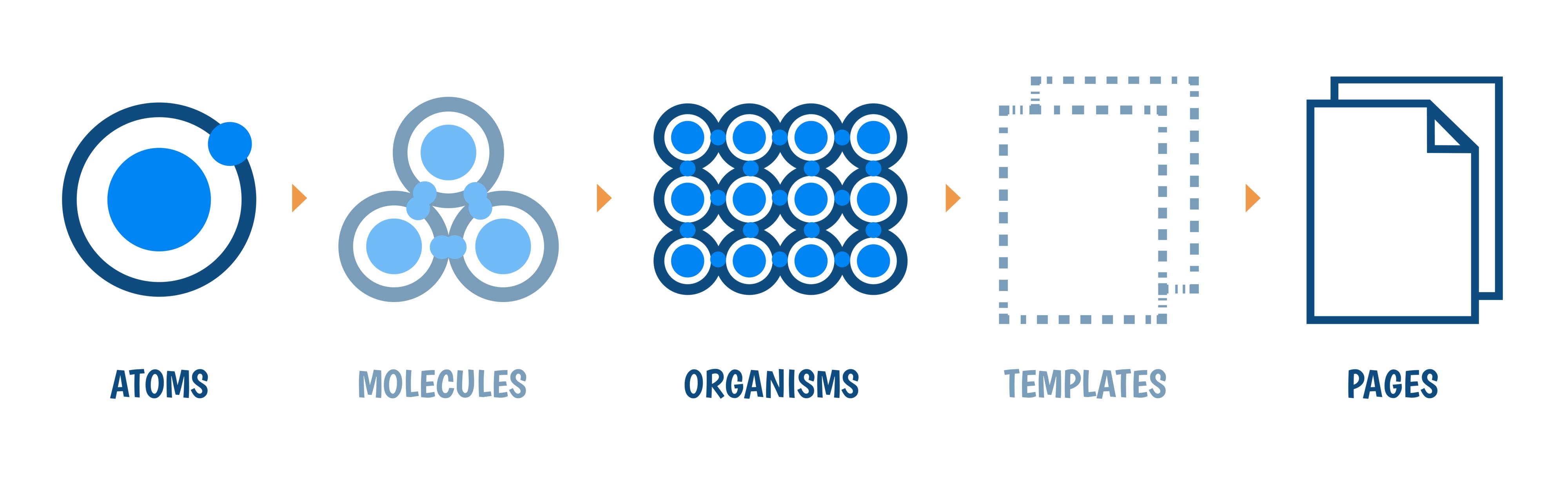
I follow the Atomic Design Methodology, I follow Atoms strictly and then bring them together in Organisms, then directly to Pages. Following the Atomic Design methodology will help you in many things while developing the project.
Less repeated code in components, this reduces the inconsistency between the components
The time to build an Organism or a Page will be faster 🚀
The style guide for the project will reside in
theme.js, The color palette, spacing, font families, font sizes, line heights, margin, padding, flex, grid and many more
 Atomic Design
Atoms
Atoms are the smallest components, like Buttons, Heading, Input, Dropdown, Icon, Tags. This plays an important role in any app. The whole state of the app mainly starts from here.
Organisms
Organisms are a combination of Atoms like Header, Card, Search Box with Icon, List Item, and many more. Once you spend planning, designing the Atom. The amount you spend on Organisms will be lesser.
Pages
Pages can be a combination of Atoms & Organisms or only Organisms, which depends on the UX design. For ex: It can be many cards with a header having a search box and some buttons.
If the components are designed in the above methodology, the time taken to build a Component will be lesser.
The main take in this is that it’s not a one time process where all the small components [Atoms] are built at one go, the design of the components will get better in time ⏰, with multiple iterations & discussions
The detailed folder structure of the components
Here I’m using Context API for shared state:
📦 src
 ┣ 📂 components
 ┃ ┣ 📂 atoms
 ┃ ┃ ┣ Heading.js
 ┃ ┃ ┣ Input.js
 ┃ ┃ ┣ Icon.js
 ┃ ┃ ┣ Tag.js
 ┃ ┃ ┗ TextArea.js
 ┃ ┣ 📂 organisms
 ┃ ┃ ┣ Card.js
 ┃ ┃ ┣ Search.js
 ┃ ┃ ┣ Upload.js
 ┃ ┣ 📂 hooks
 ┃ ┃ ┣ useIntersectionObserver.js
 ┃ ┃ ┗ useKeyPress.js
 ┃ ┣ 📂 logics
 ┃ ┃ ┣ useName.js
 ┃ ┃ ┗ useStatus.js
 ┃ ┣ 📂 pages
 ┃ ┃ ┣ 📂 Create
 ┃ ┃ ┃ ┗ index.js
 ┃ ┃ ┣ 📂 List
 ┃ ┃ ┃ ┗ index.js
 ┃ ┃ ┣ 📂 Onboarding
 ┃ ┃ ┃ ┗ index.js
 ┃ ┃ ┗ index.js
 ┣ 📂 context
 ┣ 📂 images
 ┣ 📂 styled-elements
 ┣ 📂 tests
 ┣ 📂 utils
 ┣ App.js
 ┣ constants.js
 ┣ index.js
 ┣ serviceWorker.js
 ┣ setupTests.js
 ┗ theme.js
How I structure React component
Handle the UI code in one component and separate the logic of that component in other places. This will make the component feel lightweight 🐥 and you can code better.
UI:
import React from 'react';
import { useName } from '../logics/useName';

const Create = () => {
  const { name, setName } = useName();

  const onChange = e => {
    setName(e.target.value);
  };

  return (
    <div>
      <span>{name}</span>
      <input onChange={e => onChange(e)} value={name} />
    </div>
  );
};

export { Create };
Logic:
import React, { useState } from 'react';

const useName = () => {
  const [name, setValue] = useState('');

  const setName = name => {
    setValue(name);
  };

  return { name, setName };
};

export { useName };
Styling
Normally I shuffle between Tailwind CSS or < 💅> styled-components based on the project requirements.
Tailwind CSS
If I choose Tailwind CSS I tend to choose only the needed options in tailwind.config.js and name the npm script as build:style to build the styles. Naming the script build:style will help in identifying that it's a build method for styling purpose 😃 as I mentioned earlier.
< 💅> styled-components
theme.js — Defining everything in this file, you can layout the whole style guide of the app.
export const theme = {
  breakpoints: [32, 48, 64],
  space: [0, 4, 8, 16, 24, 32, 48, 64, 128, 256, 512],
  fontSizes: [12, 14, 16, 18, 20, 24, 36, 48, 80, 96],
  fontWeights: [100, 200, 300, 400, 500, 600, 700, 800, 900],
  lineHeights: {
    normal: 1,
    title: 1.25,
    paragraph: 1.5
  },
  letterSpacings: {
    normal: 'normal'
  },
  colors: {
    black: '#000',
    white: '#fff',
    transparent: 'transparent',
    background: '',
    blue: '',
    lightblue: '',
    lighterblue: '',
    lightestblue: '',
    gray: '',
    darkgray: '',
    red: ''
  },
  radii: ['0px', '2px', '4px', '8px', '16px', '48px']
  // ... and many things
};
How to structure re-usable component using styled-components
This is an example of Atom [React Component] which can be re-used anywhere in the app.
import React from 'react';
import styled from 'styled-components';

const StyledInput = styled.input`
  color: ${props => props.disabled ? `${props.theme.colors.gray}`  : `${props.theme.colors.darkgray}`};
  font-size: ${props => `${props.theme.fontSizes[2]}px`};
  border: 1px solid;
  border-color: ${props => props.theme.colors[props.borderColor] || props.theme.colors.lightgray};
  background: ${props => props.theme.colors[props.bg] || props.theme.colors.white};
  border-radius: ${props => `${props.theme.radii[2]}`};
  padding: ${props => `${props.theme.space[2]}`};
  outline: none;

  ::placeholder,
  ::-webkit-input-placeholder {
    font-size: ${props => `${props.theme.fontSizes[2]}px`};
  }
  :-ms-input-placeholder {
    font-size: ${props => `${props.theme.fontSizes[2]}px`};
  }
`;

const Input = props => {
  return <StyledInput {...props} />;
};

export default Input;
By destructing the {...props}, the main advantage we get it the props passed to the Input component can be used as-is without any worries 😇
Hosting
I choose Netlify to host all the front end or the static sites. Netlify is easy and also makes things easy! 🚀
References: